.png)
TL;DR: Clarity rebuilt its air quality monitoring Dashboard from the ground up, keeping all the features users rely on while adding more helpful features and making the interface faster, clearer, and easier to navigate. The new Clarity Dashboard has simpler terminology, three interconnected core pages, and an AI-powered diagnostic tool called Node Doc. Sharing data, setting alerts, and exporting reports have all been streamlined. The experience now adapts automatically to each user's timezone and screen. This launch is the start of a new foundation as Clarity continually improves its air quality measurement solutions to help users turn their air quality data into action.
When does the new Clarity Dashboard come out?
Over the past few months, we have been rebuilding the Clarity Dashboard from the ground up, redesigning the navigation, core pages, charts, and the engine underneath. This new and improved version launched today, July 15th.
Log in at dashboard.clarity.io now and take a look!
What is staying the same?
Don’t worry, all of your historical data and the features you know are still there. With the new Dashboard, all of the features you rely on will be faster to reach, easier to read, and effortless to share.
The previous version of the Dashboard will remain available for the next 30 days (until August 15th), allowing users time to adjust to the new interface.

What’s new?
The new Clarity Dashboard features a range of improvements, including more intuitive language, three core pages, an AI diagnostician, and more.
Intuitive “Monitoring Locations” language
The updated Clarity Dashboard includes simpler language to enhance understanding. For instance, the term “Datasources” on the previous dashboard has now been replaced with “Monitoring Locations” because that is exactly what they are: the places where you measure air quality.
.avif)
The new Dashboard is oriented around locations, the devices deployed at those locations, and the measurements that they produce.
Three core pages: Live Data, Historical Data, and Monitoring Locations
The new Clarity Dashboard has three core pages: Live Data, Historical Data, and Monitoring Locations.
- Live Data shows what is happening right now, including the latest measurements.
- Historical Data lets you explore previous measurements and look at data trends.
- Monitoring Locations is where you manage your network.
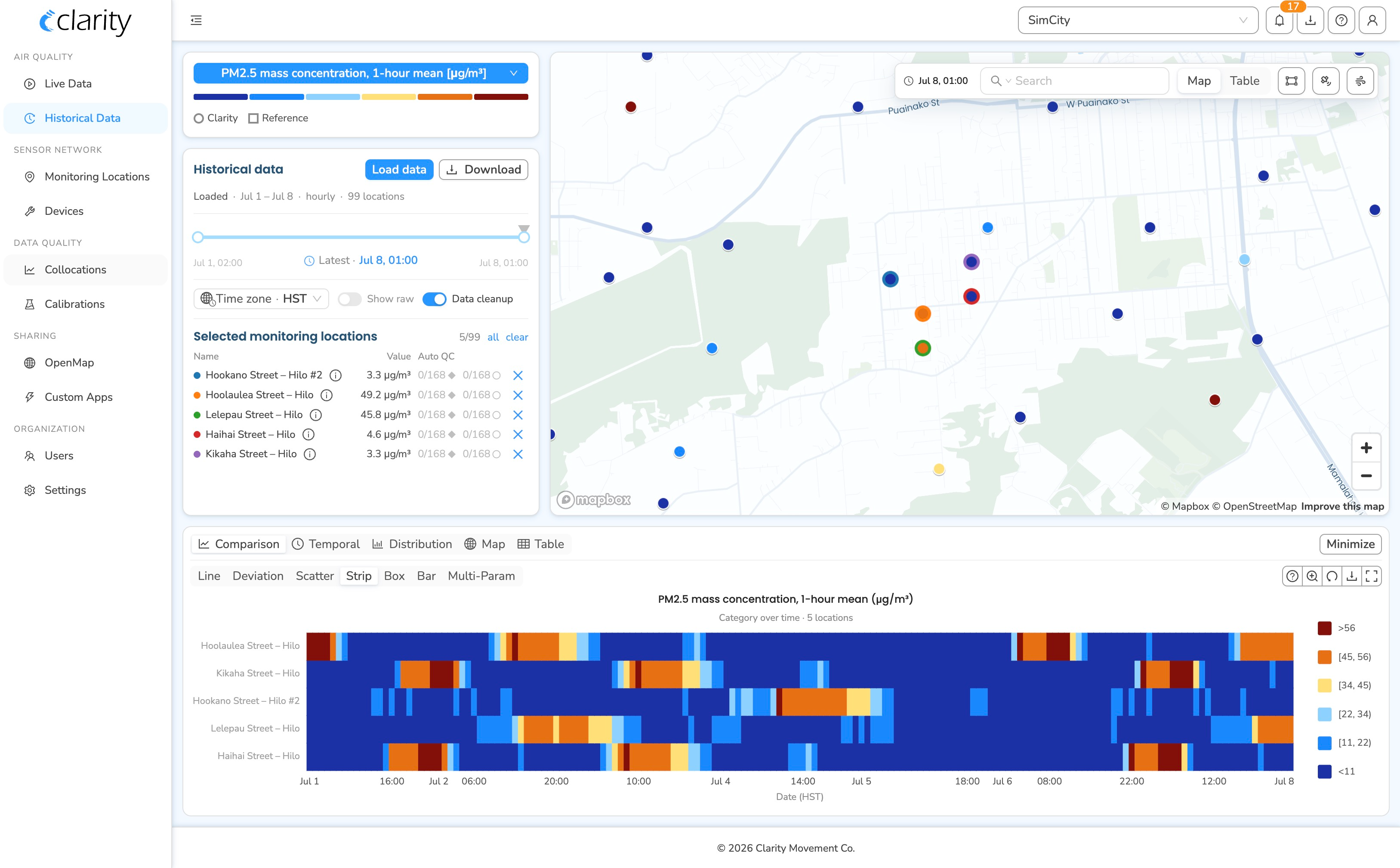
All three core pages share the same map, search, and detail panel. It is easy to jump from one page to another for the locations you are interested in, so you never have to start over. Plus, visual indicators point you to locations where devices need your attention.
Node Doc: AI-powered diagnostics and problem-solving
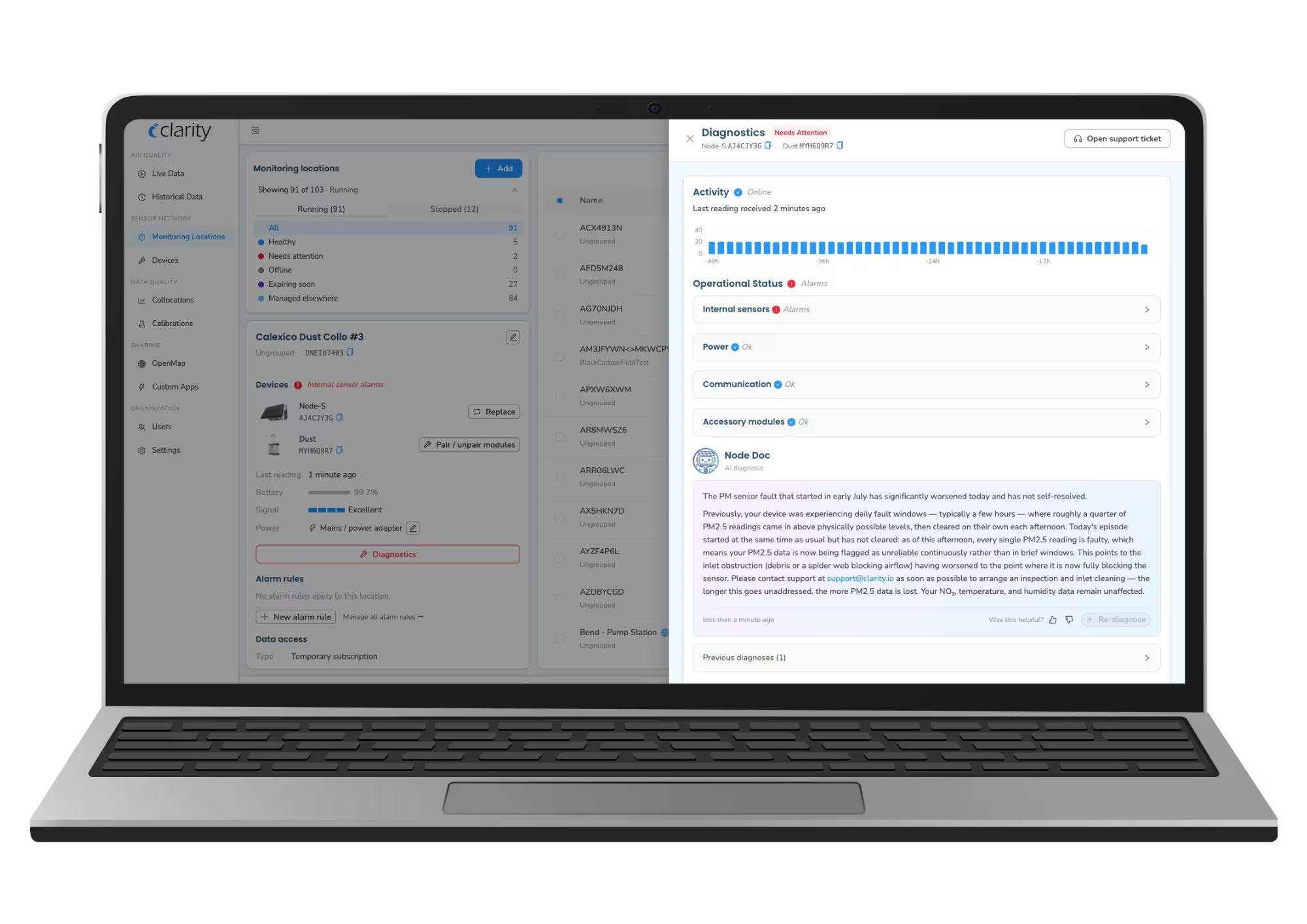
Node Doc is our new AI diagnostician. It reads the signals from your device and explains the issue in plain language, as well as providing recommendations about how to resolve it. This way, you will not only be able to identify which devices need attention, but also why and how to fix them.
As always, if you need human support from our team of air quality experts, help is just one click away. Node Doc is intended as a supplementary support layer to help you get immediate answers to technical questions, not as a replacement for your dedicated account manager.
Answers, not just charts
The updated Dashboard includes new visualizations, such as calendar views, visual comparisons, and pollution roses drawn right on the map. These visualizations help you identify patterns at a glance, like which wind direction brings air pollution. Every chart also includes a short explainer, breaking down how to read it.

More shareable
The new Dashboard makes measurements and charts easier to share. All you have to do is copy the link from your browser and send it to a colleague. They will see the same locations, time range, and charts that you do on your screen. This new feature is great for reports, meetings, or allowing someone to take a quick look at whatever it is you are doing.
Alerts and downloads come to you
Now, air quality alerts appear as a bell at the top of every page. They are easy to set and hard to miss.
Data exports have also been streamlined. You can request your data, keep working, and a notification will tell you when your file is ready.

More user-friendly
The new Clarity Dashboard features quicker loading times, live readings that refresh on their own, times that automatically display in your timezone, and a short built-in tour to show you around on your first visit, which can be replayed at any time.
Looking forward: Helping you understand your data
This big update is just the starting point. The improved Clarity Dashboard is a new foundation, ready to grow with new functionality. Clarity’s software will help you turn your air quality data into impact. Look into both our hardware and software solutions to support clean air and safeguard public health.